By: Kyerra Bright
About the Author
Kyle is a blogger since 2009 his profile has had 116 views on the website Blogger. He has made 3 – two-page magazine articles in his blogging years. They are called Eminem, Magazine and Wall-E. The one shown above is Wall-E. You can find this article at Kylzavara: Magazine Layouts (kylegeno.blogspot.com) along with the other articles as well.
Typography
The title is in Sans Serif, while the rest of the article is written in Old Style. These two fonts are contrasting each other. This is because the Old Style has a serif at the top of every letter is looks like a slanted line at the top of every letter. The Old Style also has a diagonal stress across the letters. There is also a moderate thick to thin transition in the stoke of the line most easily seen on S and e. Whereas Sans Serif has no serifs so no slanted lines at the top of the letters. It also has no think to thin stokes in its letters, so all the letters are the same thickness all the way through the work. There is also no stress in the letters because they are the same thickens all the way through the letters.
Leading Lines
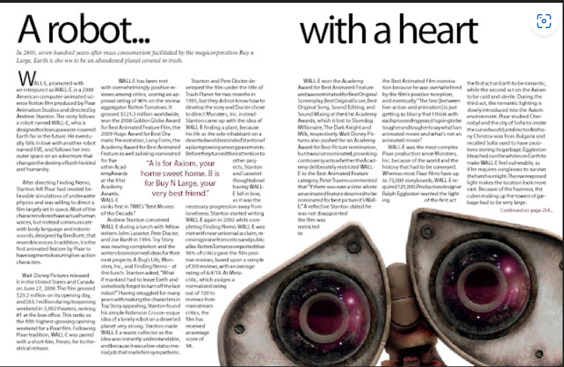
The Author uses the picture of Wall-E in the article it is an extreme close up and using leading line in the picture. He uses curved leading lines in the picture. This has the eye move across the picture and creates visual intrest in the picture as shown above in the article through the picture.
My Picture
I took three pictures, and they could replace the picture of Wall-E above.
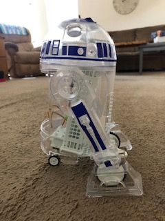
This picture is of another friendly robot, and it has leading lines as well. It shows the diagonal leading lines with its legs and the curved lines in the head. So, it is using the same principle of leading lines and could be replaced the picture in the original article.

This shows a different perspective of the picture above you can see the front side, so you have the straight lines leading lines and the curved lines of the leading lines as well.
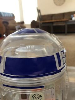
This is a close up of R2-D2 and it just has the curved lines like the picture shown in the article, so it is a good fit to replace the one in the article.
Conclusion
Typography is important especially in magazine articles because of different typography creates a different style for example you could go with Old Style which is easier to read on paper or Sans Serif which is easier to read on a computer screen. So, it depends on what you want or what you need in which style font you choose. It also helps to impact the design of the page you create you can use a fancier font in order make it look fancier or use Sans Serif or Old Style to make it look more professional. The type of font that you choose changes depending on what design you are going for. Also, with the pictures you can use leading lines to create a since of motion or stillness in the picture this helps envisage the design depending on, what you are trying to achieve for example a race car driver would want to show motion in the design while a car dealership might what stillness in the design instead.
