-
Nike Ads
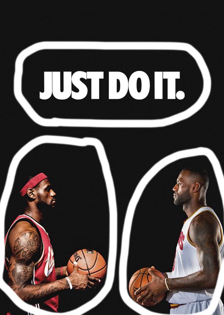
The author of this ad is Patso Dimitrov. He has created many different ads and photos. Many of them are sports related and he has a specific theme of sports in his different photos and ads that he has created. He has 1,060 people following him.
This author uses typography by bolding the letters to make them stand out. The letters are all capitalized which makes them stand out even more. With these two working with each other it just has it stand out even more. Also, the letters are not decorative, and it makes it easier to read then if it was cursive. So, with all of these things makes it stand out and easier to read.
The author uses contrast in his words the contrast of black and white is high. It makes the words easier to read then if it was dark on dark. There is also contrast with the people on the black background they jump out of the page because of the high contrast between them. So, it is very easy to find contrast in this ad.
The color in this ad is shown in the images of the people. It causes them to jump out at you. This is because the background is black and the color in this ad jumps out at you because of the contrast. Also, the colors that were chosen were brighter colors which do contrast with the black background and jump out off the page with the black background.
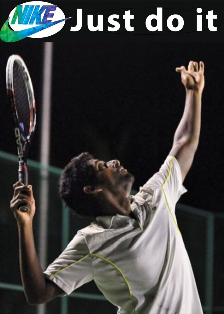
The author of this ad used the same techniques as the ad above. They used typography with the words that are easy to read. This helps because of the white lettering and the font is easy to read and so it helps the reader read what it is going on.
The author uses contrast with the words. The white letter on the black background makes the words really pop out. It also makes it easier to read through the high contrast between the two. For example, it would be hard to read if the words were dark like navy.
The author uses color sparingly on this ad just like the ad before. The things that have color really pop and stand out on the page because of the contrast because of the high contrast with the black background. Unlike the ad before the author uses a colorful Nike logo on this ad which ads interest and shows people what they are advertising.
These ads work for the same campaign because they are both related to sports and advertising the same thing. While the sports are different, they still are in the same category. They also are similar in typography, color, and contrast.
-
Photography and Typography
By: Kyerra Bright
About the Author
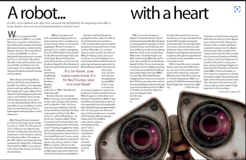
Kyle is a blogger since 2009 his profile has had 116 views on the website Blogger. He has made 3 – two-page magazine articles in his blogging years. They are called Eminem, Magazine and Wall-E. The one shown above is Wall-E. You can find this article at Kylzavara: Magazine Layouts (kylegeno.blogspot.com) along with the other articles as well.
Typography
The title is in Sans Serif, while the rest of the article is written in Old Style. These two fonts are contrasting each other. This is because the Old Style has a serif at the top of every letter is looks like a slanted line at the top of every letter. The Old Style also has a diagonal stress across the letters. There is also a moderate thick to thin transition in the stoke of the line most easily seen on S and e. Whereas Sans Serif has no serifs so no slanted lines at the top of the letters. It also has no think to thin stokes in its letters, so all the letters are the same thickness all the way through the work. There is also no stress in the letters because they are the same thickens all the way through the letters.
Leading Lines
The Author uses the picture of Wall-E in the article it is an extreme close up and using leading line in the picture. He uses curved leading lines in the picture. This has the eye move across the picture and creates visual intrest in the picture as shown above in the article through the picture.
My Picture
I took three pictures, and they could replace the picture of Wall-E above.
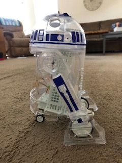
This picture is of another friendly robot, and it has leading lines as well. It shows the diagonal leading lines with its legs and the curved lines in the head. So, it is using the same principle of leading lines and could be replaced the picture in the original article.

This shows a different perspective of the picture above you can see the front side, so you have the straight lines leading lines and the curved lines of the leading lines as well.
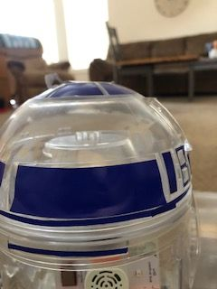
This is a close up of R2-D2 and it just has the curved lines like the picture shown in the article, so it is a good fit to replace the one in the article.
Conclusion
Typography is important especially in magazine articles because of different typography creates a different style for example you could go with Old Style which is easier to read on paper or Sans Serif which is easier to read on a computer screen. So, it depends on what you want or what you need in which style font you choose. It also helps to impact the design of the page you create you can use a fancier font in order make it look fancier or use Sans Serif or Old Style to make it look more professional. The type of font that you choose changes depending on what design you are going for. Also, with the pictures you can use leading lines to create a since of motion or stillness in the picture this helps envisage the design depending on, what you are trying to achieve for example a race car driver would want to show motion in the design while a car dealership might what stillness in the design instead.
-
Hello World!
Welcome to WordPress! This is your first post. Edit or delete it to take the first step in your blogging journey.
-
Four Principles of Design: In Action

Introduction

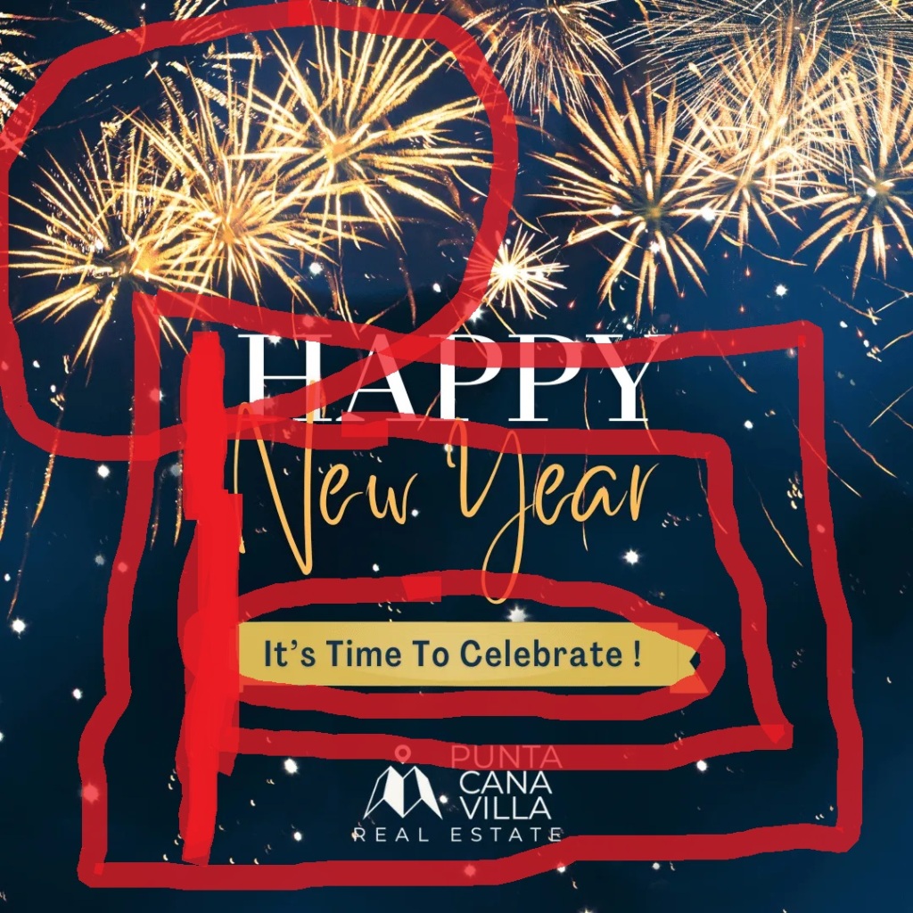
The picture above is located at https://puntacanavilla.blogspot.com/2022/12/happy-new-year-2023.html is was posted by Victor Matos Cabrera. He has been a blogger since April of 2022 and his profile has had 40 views so far. The design of the above image is pretty simple the alignment is centered aligned and the background pops because of the contrast that it holds with the foreground of the picture. Also the picture as a whole has similar colors which ties everything together. It appeals because of the simplistic design and is not to in your face about its design. This picture shows a good use of the center alignment.
Contrast
The fireworks contrast with the dark blue background. This gives the effect that the sky is behind the fireworks. It also makes the fireworks stand out when they contrast that deeply. It also brings excitement to the page because of the deep contrast. Everyone loves to watch the fireworks at the end of the night to celebrate The New Year!
Repetition
The goldish color is repeated throughout the picture. You can see this color in the fireworks the lettering and the banner below the Happy New Year. Using the same color throughout the picture makes everything look cohesive and put together. The color being repeated makes your eye move down the page and back up to the top of the page again. It makes your eyes stay on the page longer than they otherwise would have.
Alignment
The alignment of the picture above is a center alignment. While we tend not to use the center alignment much anymore because of the awkward blank space around it. The picture above does it well because of the added gradient and fireworks at the top and bottom of the page. The alignment gives the page more impact because it is centered.
Proximity
The proximity of all the words tells us that they are all related to each other. It is important to note that the words are indeed related to each other. Everything is not put willy nilly on the page everything has a place and it looks nice how they laid everything out. Happy New Year Its time to celebrate! It is one complete sentence, so it makes sense to have them close to each other, so the picture makes sense.
Color
The banner is gold while the lettering in blue. This makes it stand out because it is the only thing that has a color as the outline of the words. Using color this way makes the banner stand out and grabs the reader’s attention. Color also makes the page have a cohesive feel because the color is repeated throughout the picture. The background also has one color it may be a gradient, but it is one color which does not distract from the words. The color adds to the picture.
Conclusion
The contrast between the background and the fireworks gives the reader somewhere to start and it is at the top of the page. The repetition of the goldish colors gives the readers eyes somewhere to go next. The center alignment gives a more formal look to the picture. The proximity of the words means that they all relate to each other. The color gives the picture a more cohesive look.
-
Subscribe
Subscribed
Already have a WordPress.com account? Log in now.
