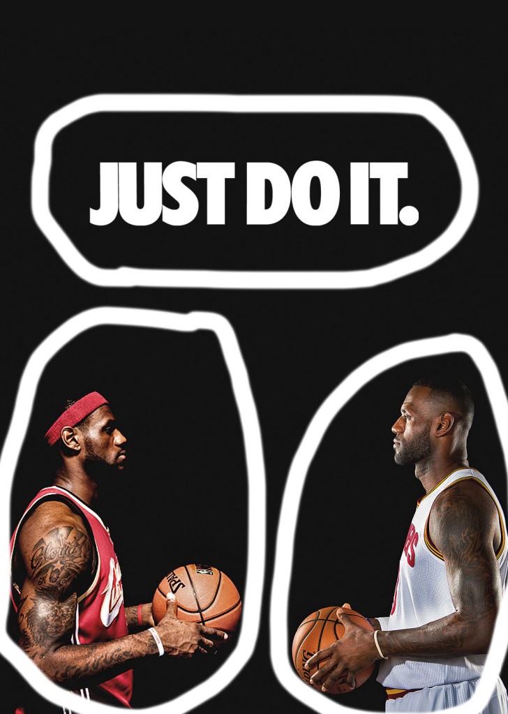
The author of this ad is Patso Dimitrov. He has created many different ads and photos. Many of them are sports related and he has a specific theme of sports in his different photos and ads that he has created. He has 1,060 people following him.
This author uses typography by bolding the letters to make them stand out. The letters are all capitalized which makes them stand out even more. With these two working with each other it just has it stand out even more. Also, the letters are not decorative, and it makes it easier to read then if it was cursive. So, with all of these things makes it stand out and easier to read.
The author uses contrast in his words the contrast of black and white is high. It makes the words easier to read then if it was dark on dark. There is also contrast with the people on the black background they jump out of the page because of the high contrast between them. So, it is very easy to find contrast in this ad.
The color in this ad is shown in the images of the people. It causes them to jump out at you. This is because the background is black and the color in this ad jumps out at you because of the contrast. Also, the colors that were chosen were brighter colors which do contrast with the black background and jump out off the page with the black background.

The author of this ad used the same techniques as the ad above. They used typography with the words that are easy to read. This helps because of the white lettering and the font is easy to read and so it helps the reader read what it is going on.
The author uses contrast with the words. The white letter on the black background makes the words really pop out. It also makes it easier to read through the high contrast between the two. For example, it would be hard to read if the words were dark like navy.
The author uses color sparingly on this ad just like the ad before. The things that have color really pop and stand out on the page because of the contrast because of the high contrast with the black background. Unlike the ad before the author uses a colorful Nike logo on this ad which ads interest and shows people what they are advertising.
These ads work for the same campaign because they are both related to sports and advertising the same thing. While the sports are different, they still are in the same category. They also are similar in typography, color, and contrast.
