
Introduction

The picture above is located at https://puntacanavilla.blogspot.com/2022/12/happy-new-year-2023.html is was posted by Victor Matos Cabrera. He has been a blogger since April of 2022 and his profile has had 40 views so far. The design of the above image is pretty simple the alignment is centered aligned and the background pops because of the contrast that it holds with the foreground of the picture. Also the picture as a whole has similar colors which ties everything together. It appeals because of the simplistic design and is not to in your face about its design. This picture shows a good use of the center alignment.
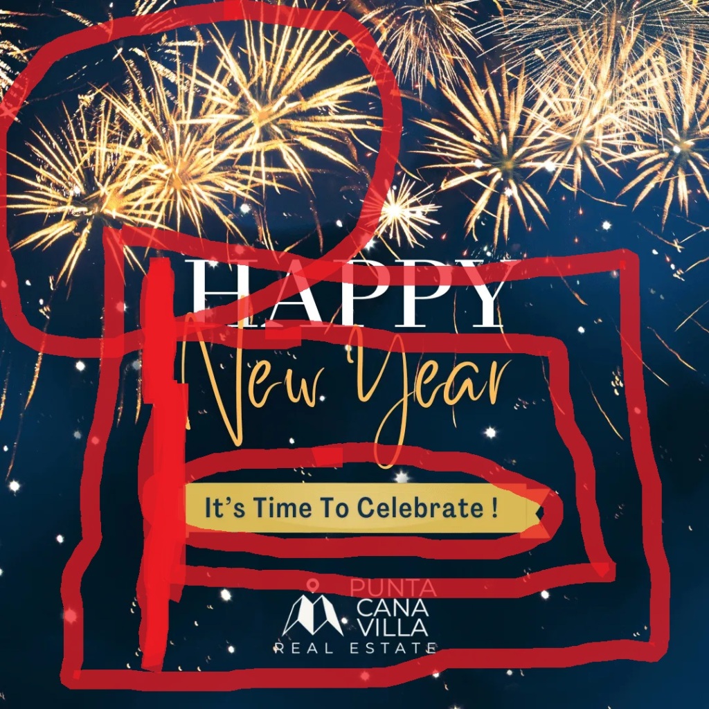
Contrast
The fireworks contrast with the dark blue background. This gives the effect that the sky is behind the fireworks. It also makes the fireworks stand out when they contrast that deeply. It also brings excitement to the page because of the deep contrast. Everyone loves to watch the fireworks at the end of the night to celebrate The New Year!
Repetition
The goldish color is repeated throughout the picture. You can see this color in the fireworks the lettering and the banner below the Happy New Year. Using the same color throughout the picture makes everything look cohesive and put together. The color being repeated makes your eye move down the page and back up to the top of the page again. It makes your eyes stay on the page longer than they otherwise would have.
Alignment
The alignment of the picture above is a center alignment. While we tend not to use the center alignment much anymore because of the awkward blank space around it. The picture above does it well because of the added gradient and fireworks at the top and bottom of the page. The alignment gives the page more impact because it is centered.
Proximity
The proximity of all the words tells us that they are all related to each other. It is important to note that the words are indeed related to each other. Everything is not put willy nilly on the page everything has a place and it looks nice how they laid everything out. Happy New Year Its time to celebrate! It is one complete sentence, so it makes sense to have them close to each other, so the picture makes sense.
Color
The banner is gold while the lettering in blue. This makes it stand out because it is the only thing that has a color as the outline of the words. Using color this way makes the banner stand out and grabs the reader’s attention. Color also makes the page have a cohesive feel because the color is repeated throughout the picture. The background also has one color it may be a gradient, but it is one color which does not distract from the words. The color adds to the picture.
Conclusion
The contrast between the background and the fireworks gives the reader somewhere to start and it is at the top of the page. The repetition of the goldish colors gives the readers eyes somewhere to go next. The center alignment gives a more formal look to the picture. The proximity of the words means that they all relate to each other. The color gives the picture a more cohesive look.
